Inside How Stripe Crafts Quality Products | Katie Dill (Stripe Head of Design)
A deep dive into Stripe’s rituals and principles to produce surprisingly great work
Dear subscribers,
Today, I want to share a written interview with Katie Dill, Stripe’s Head of Design.
Stripe is a company that’s widely known for its focus on craft and quality and Katie is one of the most influential design leaders in tech. Previously, she was the Head of Design at Airbnb and Lyft.
Katie and I had a great chat about:
Defining what craft and quality means
Should a product be useful first and then beautiful?
Stripe’s rituals to level up product quality
Keeping quality a priority as companies scale
This interview is a must-read if you’re a designer, PM, or builder who cares about craft. Let’s dive in.
Defining what craft and quality means
Welcome, Katie! To start, how would you define craft and quality?
Craft is about the how - the thinking, work, and mastery that goes into creating something. Quality is often the output of that process.
You can have craft without quality, but rarely quality without craft.
For example, imagine a chair with great details that’s uncomfortable to sit in. Would you say that's a quality chair? It might have nailed the aesthetics, but you can't spend more than three minutes sitting in it.
To me, that’s a well-crafted chair but not high quality.
Many people think quality is just the aesthetics or how beautiful the product is, but I think you have a much broader definition than that.
Well, first, aesthetics do matter and should not be shortchanged. Some people think aesthetics are just surface level, but I think aesthetics can also make a product feel more useful and compelling.
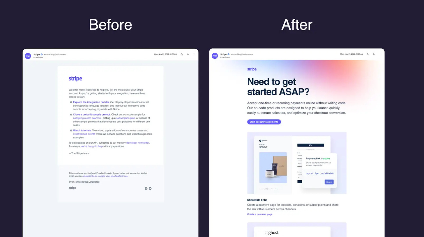
We've seen this in our work. When we upgraded the aesthetics and content of an email with better typography, layout, and imagery, it increased product conversion by 20%.
But quality is obviously not just the aesthetics. I think there are three levels:
Does it have utility? Going back to a chair, can I sit in it? That's paramount.
Is it usable? If the chair is not comfortable, then I can't make use of it.
Is it beautiful? Is it well executed in the details such that it's enjoyable?
At Stripe, we believe we must get all three aspects right.
Our work is consequential — our users are moving money around the planet. If we don't get the details right, it impacts our users' ability to achieve their goals and provide for their customers.
Should utility come before beauty?
I’ve interviewed designers who think: “Let’s make the product useful first, then let’s make it beautiful later.” What’s your perspective on this?
There's some truth to that. If you only have beauty without utility, you might delight a customer briefly, but they’ll inevitably churn. Customers have many options and are too busy to be distracted by things that don’t add value.
But I also think some folks focus too far on just utility.
Beauty can elevate utility and usability.
Beauty can attract users to your product and motivate them to try it earnestly. If users have to jump through hoops to get the utility, they might never reach the magic moment. So ask yourself these questions:
Is your product clear for users, given their mental model and context?
Can users quickly understand what your product does?
Have you removed every roadblock for them to realize the utility of your product?
How long you wait to fix these issues will impact your ability to build a direct relationship with users and get feedback about what matters.
Yes I think the problem with “utility before beauty” is it can become an excuse to never get to the beauty part at all.
Yep, we’ve all read books on MVPs. I think it’s important to ship an MVQP (Minimum Viable Quality Product):
An MVQP solves the user problem in a complete way, with a level of refinement that helps them use it effectively and build trust in the product and company.
While we believe in shipping quickly and getting things out in Alphas or Previews so we can learn and build with users, we wouldn't want to ship something so lacking that we set users up to fail and can’t even get usable feedback.
Just to play devil’s advocate, there are many successful B2B products that I wouldn’t necessarily label high quality. Why does Stripe care so much?
Unfortunately, enterprise software hasn't had the best reputation for quality.
But I think the tides are changing. Companies are realizing that enterprises are made up of people who want to interact with usable, powerful products that spark joy.
At Stripe, we believe that tiny product details can greatly impact our users’ growth.
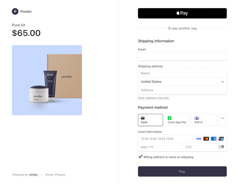
For example, we created a checkout experience that helps businesses increase revenue by 11.9% on average. The details we've obsessed over for 14 years allow that to happen.
Most enterprise companies assume people can be trained to use their product, but that extra effort keeps customers from achieving their goals faster. We aspire to make our products straightforward and intuitive, so you don't necessarily need to be trained to benefit from the products and features. You might even enjoy using it.
Stripe’s rituals to level up product quality
It must be great to be head of design for a company where the founders (Patrick and John) care so much about craft and quality.
Yes! Patrick and John instill this in our culture.
One of our operating principles is user focus.
Patrick has said he would be far less happy if Stripe was successful but not well-crafted and beautiful. He thinks beauty plays a role simply because it brings joy and makes the world feel better. I agree, but we also have proof that beauty makes business sense. As I said earlier, those details make our products easier to engage with and have also helped to build our brand.
How do product teams at Stripe build with users and businesses?
Our users are very forward with what they need because they’re trying to run their business with Stripe.
But often, we can show users things they didn't think possible — such as the ability to provide the right payment methods through Checkout dynamically.
We spend a lot of time talking to our users and observing how they get things done. We want to understand their needs better than they do so that we can exceed their expectations. Look:
Even the best builders can make decisions and assumptions that are wrong.
So we practice continually showing things to users, getting feedback, and iterating, sometimes in less than 24-hour cycles. This has been key to our success.
For example, we do Product Preview programs where we launch the product to a subset of users. These users are invested in helping make the product better because it makes a big difference for them.
Building with users also de-risks the product. If Preview users love your product, there’s a higher chance that the public will love it too.
Yes, most of our products have been created in concert with our users. Even our Connect product came about in the early days while working with Lyft. They needed more from our payments platform to pay drivers in and out.
That helped form Connect over time, and now Stripe Connect is the world’s largest provider of payments and money movement for platforms, used by fast-growing platforms like Jobber and StyleSeat and scaled leaders like Shopify. Building with our users is definitely for the best in product design.
Another great Stripe practice is friction logs to feel the user’s pain yourself. Can you explain how friction logs work and how you encourage employees to do them?
Friction logs require you to use the product and write down all the friction points.
They’re not a substitute for talking to users but an addition. Our users won't always tell us about every little thing they see, or maybe subconsciously, it doesn't feel right, but they don't know why. We want to experience it ourselves and understand it.
We also want to look at things not just in isolation. Let's say you're a PM, designer, and engineer working on a product, thinking about it all day. Maybe it's a couple of pages in an interface. You're ready to ship. Have you thought about how the person will find it? Is there an email being sent? What's the language in the email, and does it map to the language on the website? Once you click, where do you end up? What happens if you have an issue and need to contact support? How is that all connected?
At Stripe, PMs, engineers, and designers constantly do these "walk the store" exercises, experiencing it as a customer would.
They jot down what they see, take screenshots, identify where language isn't clear and things aren't using our style guide, and quickly log bugs when they find them.
What's powerful is thinking across time and place, like a user would. We score these user journeys, track them, and log them regularly to see if we're improving.
Do you do this across the entire customer journey that combines multiple products?
Yes, anyone in the company can do friction logs.
They’re encouraged to do logs for other team’s products and post them in a channel where anybody can read them.
They're a good way to see how someone might experience the product, especially parts you're unfamiliar with.
We also have a program called "essential journeys" — friction logging to the nth degree.
We started by identifying our top 15 primary user flows or jobs to be done. What are the top things our customers are trying to accomplish, and what do those journeys look like? These journeys include:
Getting started with Stripe and identifying the right product for their needs
Setting up our billing product to charge subscriptions
Creating a Payment link without code to accept online payments
Once a quarter, a team of engineers, designers, and PMs will review that experience, friction log it, and score it. We have a scoreboard shared with the company and a company goal to ensure these journeys stay green according to our quality rubric.
What is your metric to measure quality?
Unsurprisingly, we have a checklist to help people assess the quality of their products, and its categories include utility, usability, craft, and beauty. But that’s just a guide to help people remember things that matter, like copy, motion, load time, transitions, etc. It’s neither comprehensive nor sufficient as a means for measurement.
I’ll probably be in pursuit of how to measure quality for the rest of my career.
Everybody talks about it like a holy grail, but the truth is there isn’t just one way to measure quality. It all depends on the user and their context, what they are trying to do, and what the intention of the product is. Quality for one product might mean something very different than for another.
We've been holding a product quality QBR (quarterly business review) once a quarter. We have several metrics we track related to quality that we review for every major product area, including:
Essential journeys: This is an employee's view of how good or bad the experience feels. It's qualitative, using a five-point scale (red, orange, yellow, lime green, green). We intentionally kept it simple to avoid false precision.
Customer sentiment: We use CSAT (Customer Satisfaction) surveys and PSAT (Product Satisfaction) surveys for more quantitative user opinions and abundant qualitative user research.
Support tickets and bugs: We track these to identify recurring issues and inadvertent errors in production.
Product efficacy: We look at metrics that help us understand whether the product achieves its goal and solves the user's problem.
Together, this suite of metrics gives us a sense of whether the product is quality.
Keeping quality a priority as companies scale
As companies get larger, I’ve found that teams start thinking about the quality of internal artifacts instead of customer-facing products. They start thinking, "I need to present to the CEO, so this deck must be high quality." How do you balance this at Stripe?
It’s not good when wanting to impress an exec internally puts more pressure on teams than the fear of not shipping something great to a customer. We don't want to be in that business.
The primary goal of our product reviews is to understand what the user experience will be and what users will think.
We want to minimize “presentationing.” We try to avoid the decks, the setup, and the "let me tell you the story" narrative as much as possible.
We do this for a few reasons:
Users don’t have the context. You're biasing people in the meeting about product quality because you've told them all this stuff that users wouldn't know.
Let’s just use the product. We like reviews where we just jump into the prototype or product, see it, and feel it from the user’s perspective. That helps make the feedback more useful.
Avoid wasting time on internal artifacts. Sometimes, we need to tell a story, but we constantly look for ways to get closer to what the user would feel.
If I care about craft and quality, how do I find a work environment where these things are valued so I can feel good about coming to work every day?
Someone once advised me that you can't force it upon the organization. It'll probably be a hard battle to fight if it's not in the company's DNA. I can't tell you whether I believe that to be true – I might be a glutton for punishment.
But I think leading by example is the best way to focus on craft and quality. Show your company what great looks like and the cost of poor decisions.
Unfortunately, most companies' gravitational pull is not to pursue excellence.
It's just way too easy to ship something that's just “good enough” for many reasons — we've got to get it out fast, we don't have the resources, we'll come back to it later.
It's those micro-decisions every day that slowly but surely will make your product mediocre. So you must hold steadfast to "it's not good enough yet." Let's put another day into it. Let’s have the courage to stop the ship.
We could talk about quality all day, but nothing will matter unless we can see and feel it. I find the best way to convince others is just by using the product together — walking the store and going to talk to users. That can be exceptionally enlightening to help people understand where you are regarding quality and where you want to be.
I want to reflect on my career and be proud of what I delivered. Software products come and go, and it’s rare to ship something that makes a lasting impact.
I agree. We put so much time and effort into our jobs.
We should be doing things we're proud of. Time's too short to waste putting things out into the world you're not excited about.
Thank you Katie! If you love this conversation, please follow Katie on X and LinkedIn.


This reminds us that quality isn’t just about aesthetics—it’s about the entire user experience that builds trust.
it would interest to have her talk about her playbook across ABNB, Lyft, and Stripe to understand how she navigated/ guided the focus on quality.